


Everybody makes a big deal out of Pantone’s color choice every year, but there are a bunch of other companies that select a color of the year. Here are a few, along with examples of how you might incorporate each of them into your wedding. If you weren’t wild about Veri Peri, how do you feel about these?
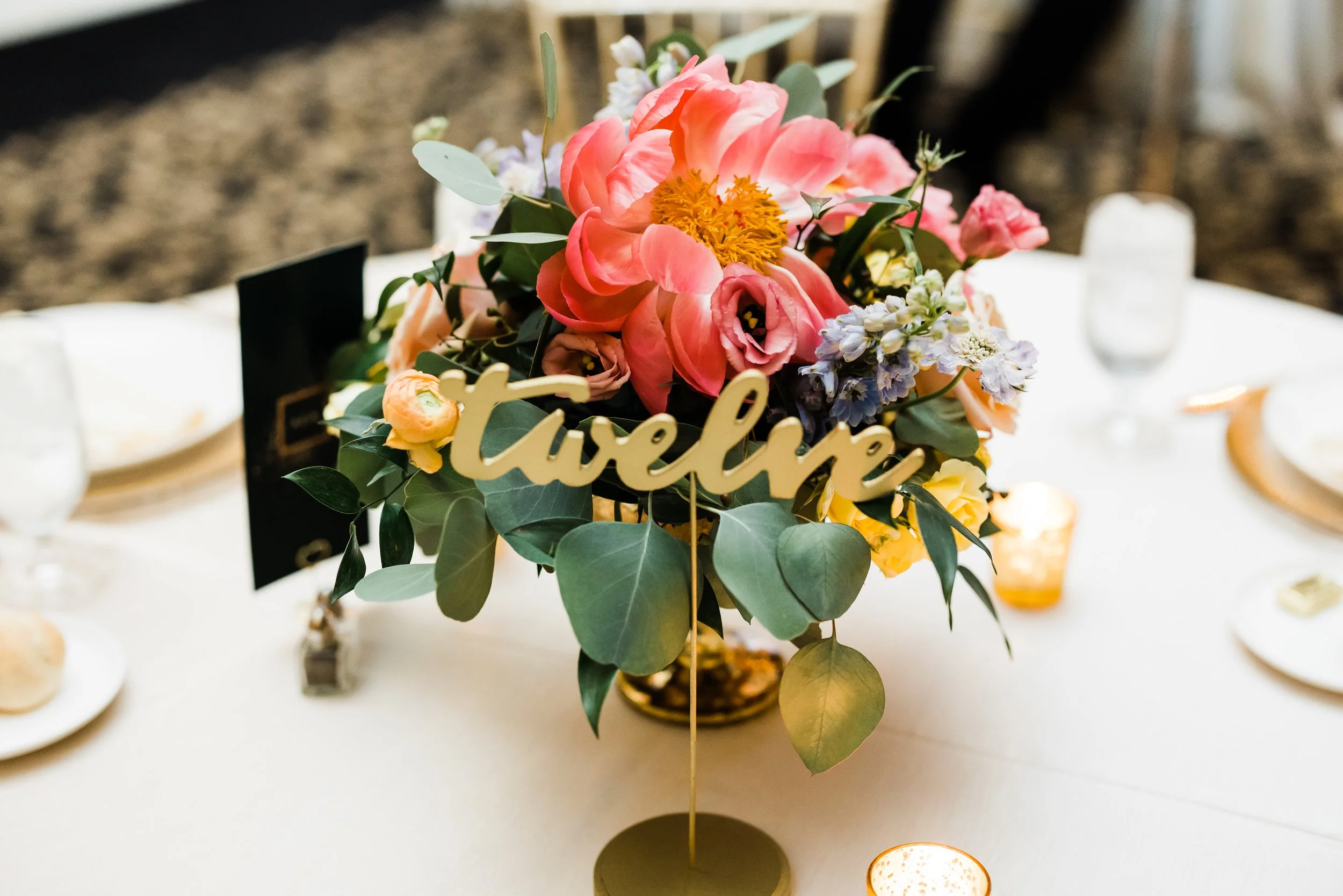
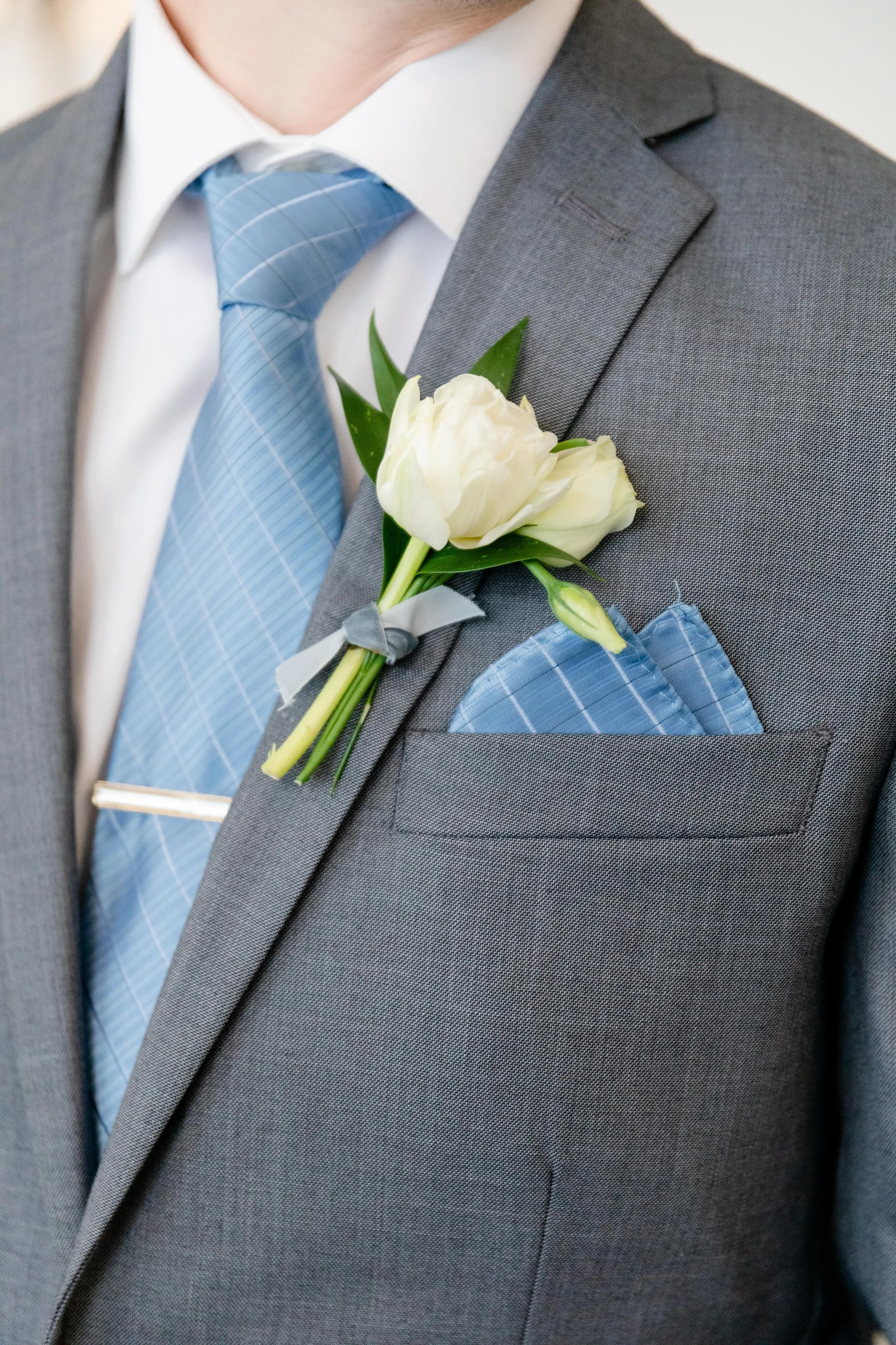
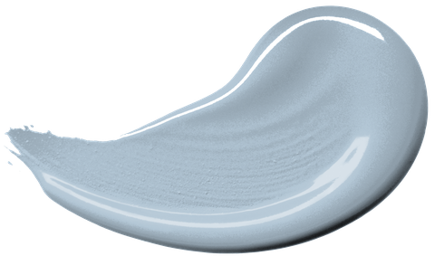
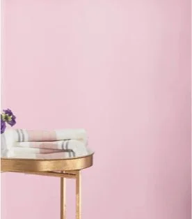
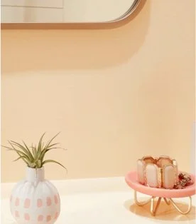
Genuine Pink
Floral trends magazine Thursd selected Genuine Pink, a serene, dusty pink, reminding us to connect with both ourselves and others.

Paint companies also like to get in on the color game, and many select a color of the year. This year light greens and blues dominated the field.
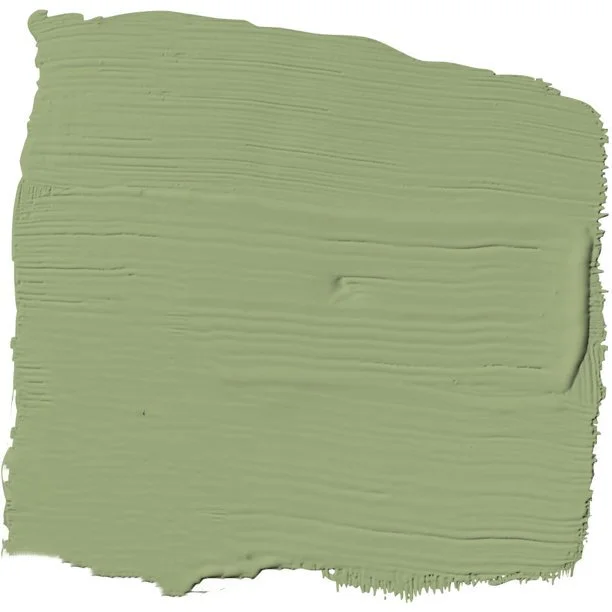
Laurel Leaf
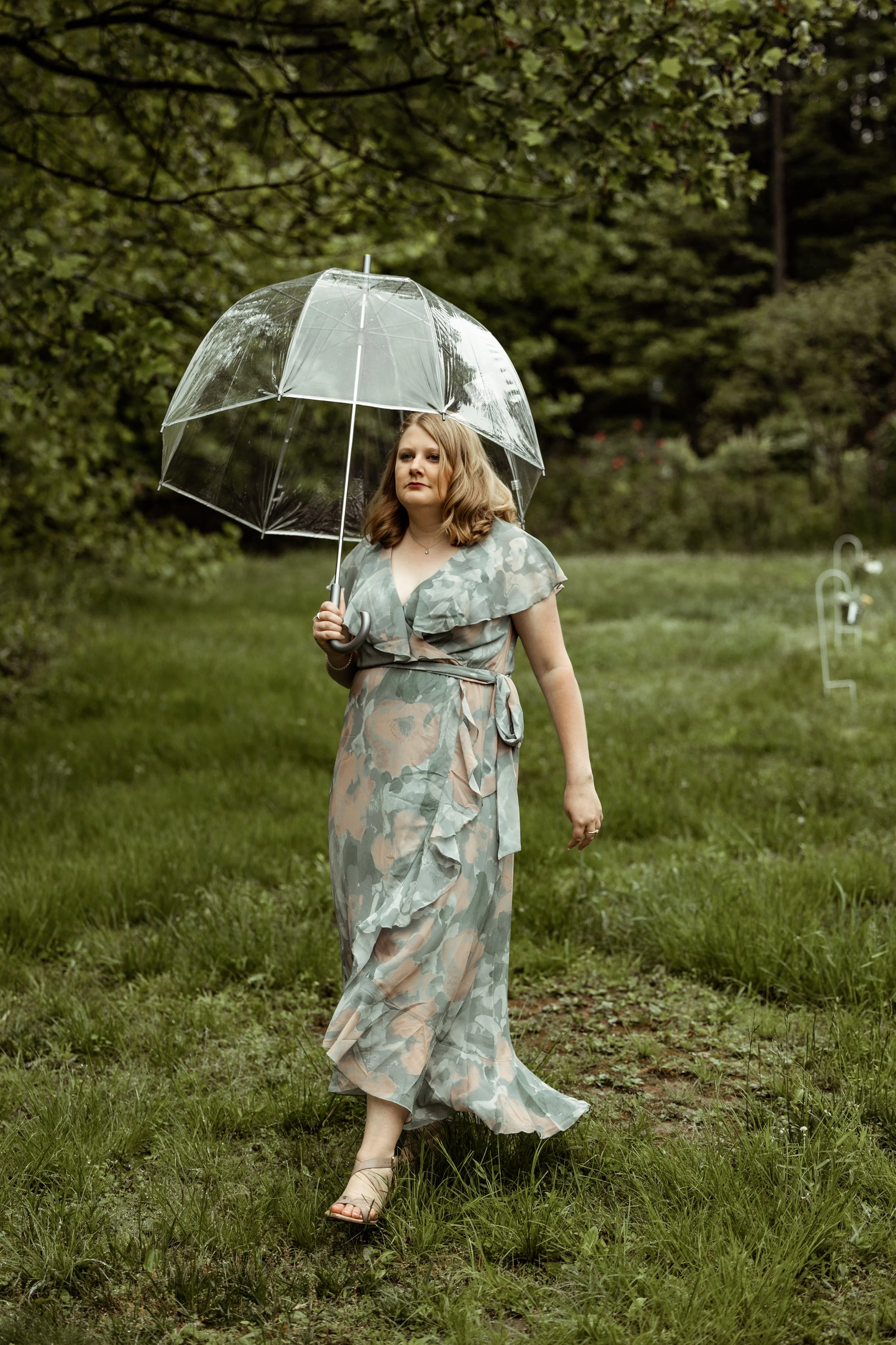
Better Homes & Gardens selected Laurel Leaf, a dusty green, because after being inside so much during the pandemic, we are attracted to elements of nature and incorporating them into our homes.

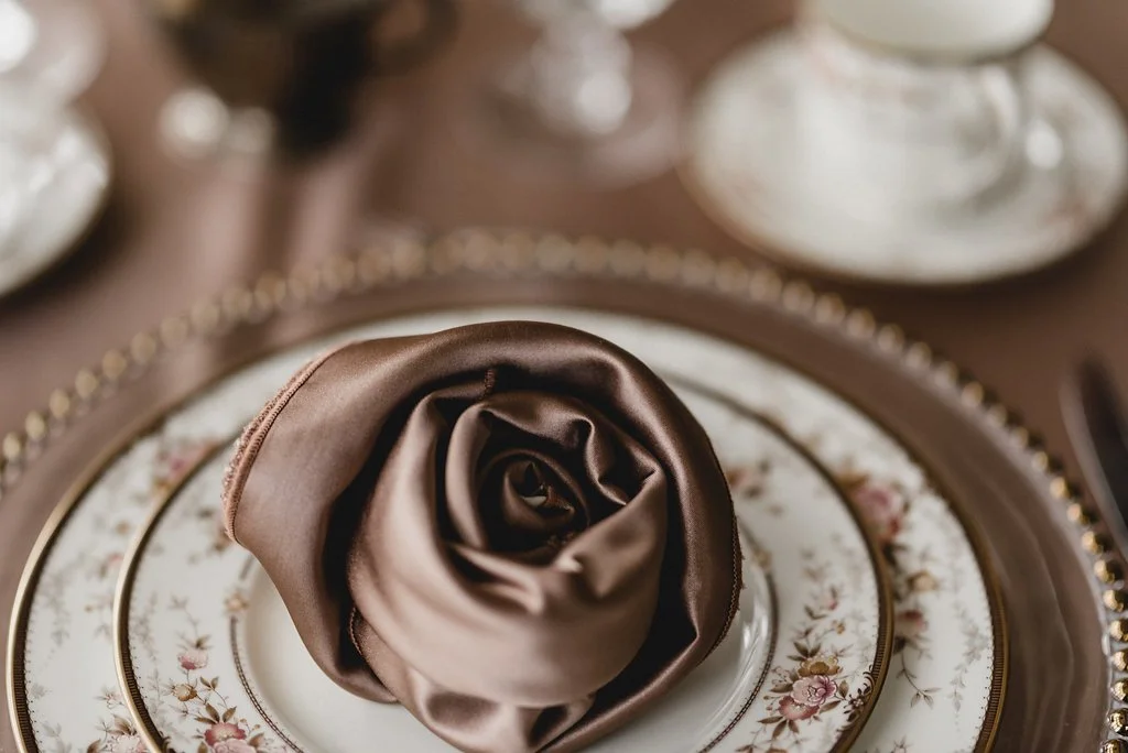
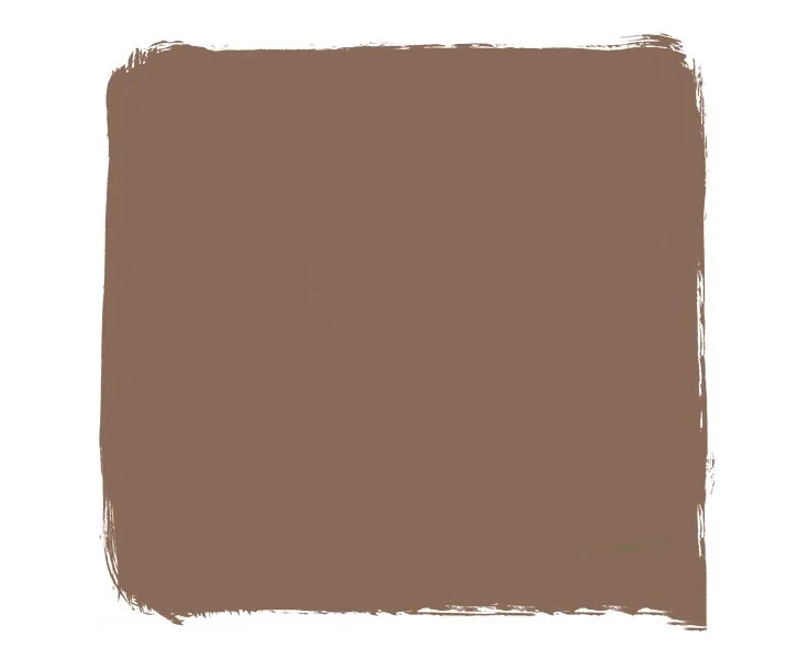
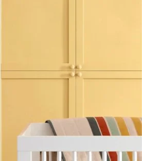
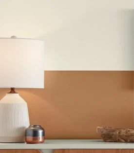
Art and Craft
Dunn-Edwards selected a soft, sophisticated brown —Art and Craft — as a peaceful, grounding color because this down-to-earth shade signifies the stability, comfort, and calm we are all seeking right now.

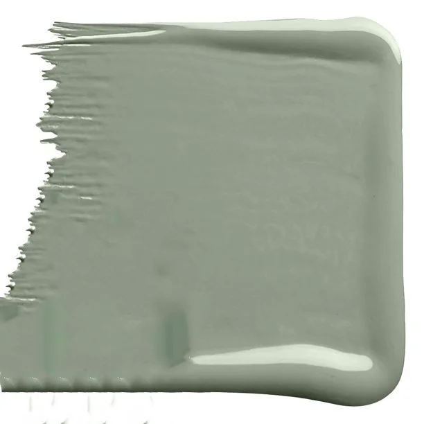
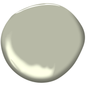
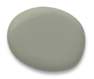
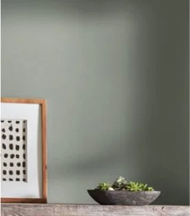
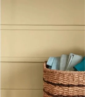
October Mist
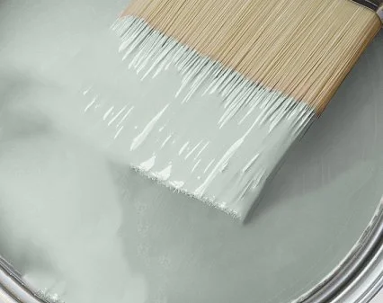
Benjamin Moore selected a soft, silvery green - October Mist.

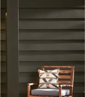
Evergreen Fog
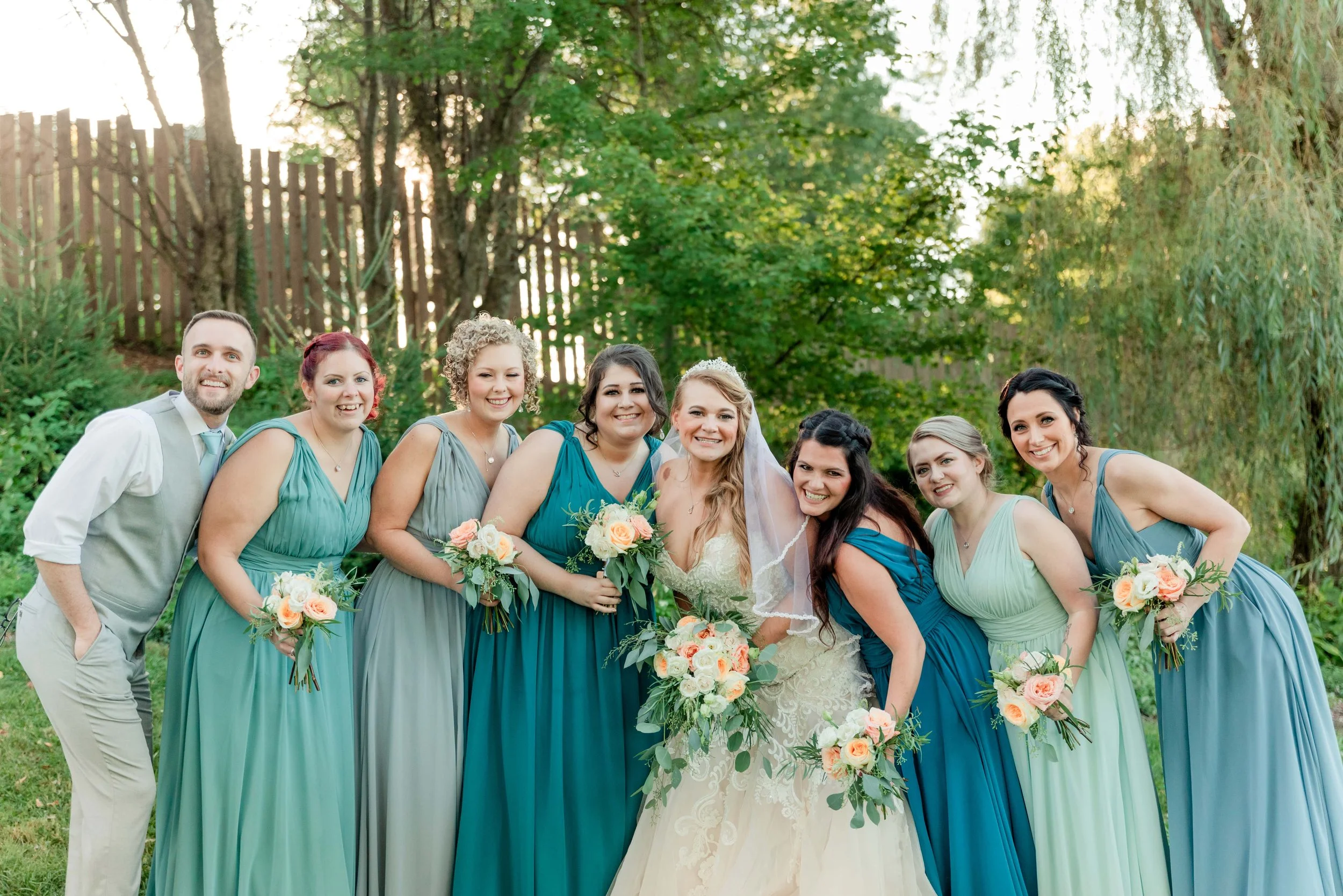
Sherwin-Williams also selected a green: Evergreen Fog, a mid-tone, gray-green that is a subtle, yet stunning statement shade emblematic of “growth, rebirth, and joy.” Sherwin- Williams says the shade is capable of merging the spirit of organic modernism with the aesthetics of the ’70s, which is very on trend in the wedding industry as well.

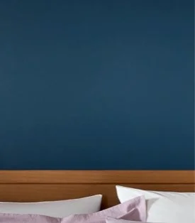
Aleutian
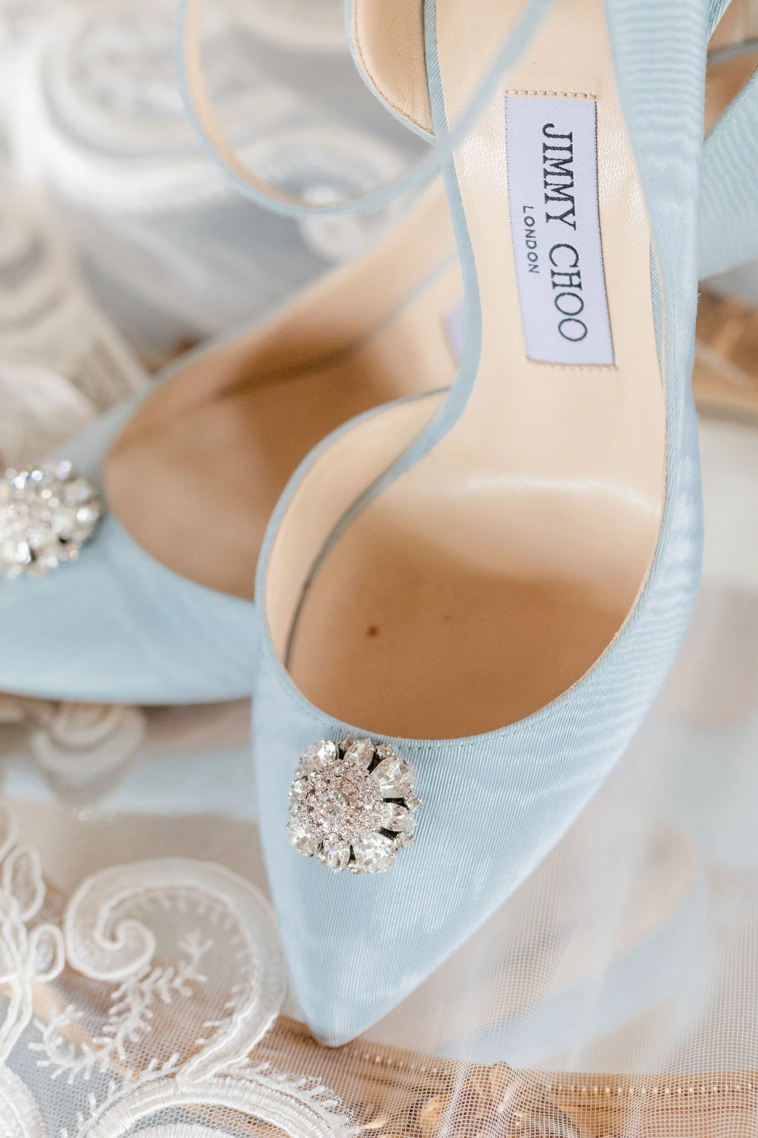
HGTV Home (Sherwin-Williams) went in the blue direction with Aleutian - a faded, blue-gray indigo that embodies comfort and relaxation.


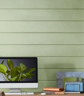
Guacamole
Glidden went with a zingy green called Guacamole.

Breezeway
Behr chose a soft, silvery blue-green they named Breezeway to establish a feeling of tranquility, but its crisp brightness can also inspire energy and liveliness. The Behr VP calls it, “a color that welcomes a hopeful sense of renewal, restoration, and healing."

Olive Sprig
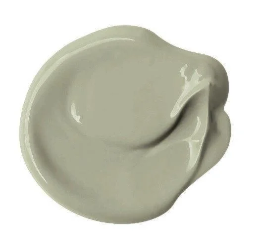
PPG also chose green - a lush, mid-tone sage green, Olive Sprig, that can be a brighter alternative to traditional neutrals. It is supposed to represent regrowth and the resiliency of nature as we adapt to new ways of living post-pandemic.

Breathe
Graham & Brown selected a pale, powdery blue paint named Breathe, which looks perfect with their wallpaper of the year Restore Midnight, a deep blue, nature-inspired wallpaper.


Bright Skies
Dulux also chose a gray-toned blue, but named it Bright Skies. Dulux says this blue is a fun yet functional option that pushes the boundaries of a neutral without “flying too close to the sun.”


Slate of Twelve Natural Inspired Colors
Valspar chose a whole suite of colors, but all are still shades inspired by nature — Blanched Thyme, Gilded Linen, Delighted Moon, Lilac Lane, Mountain River, Orchid Ash, Grey Suit, Subtle Peach, Rustic Oak, Sunset Curtains, Country Charm, and Fired Earth. (Also, if I ever stop being a wedding planner, I want to be a color namer!)


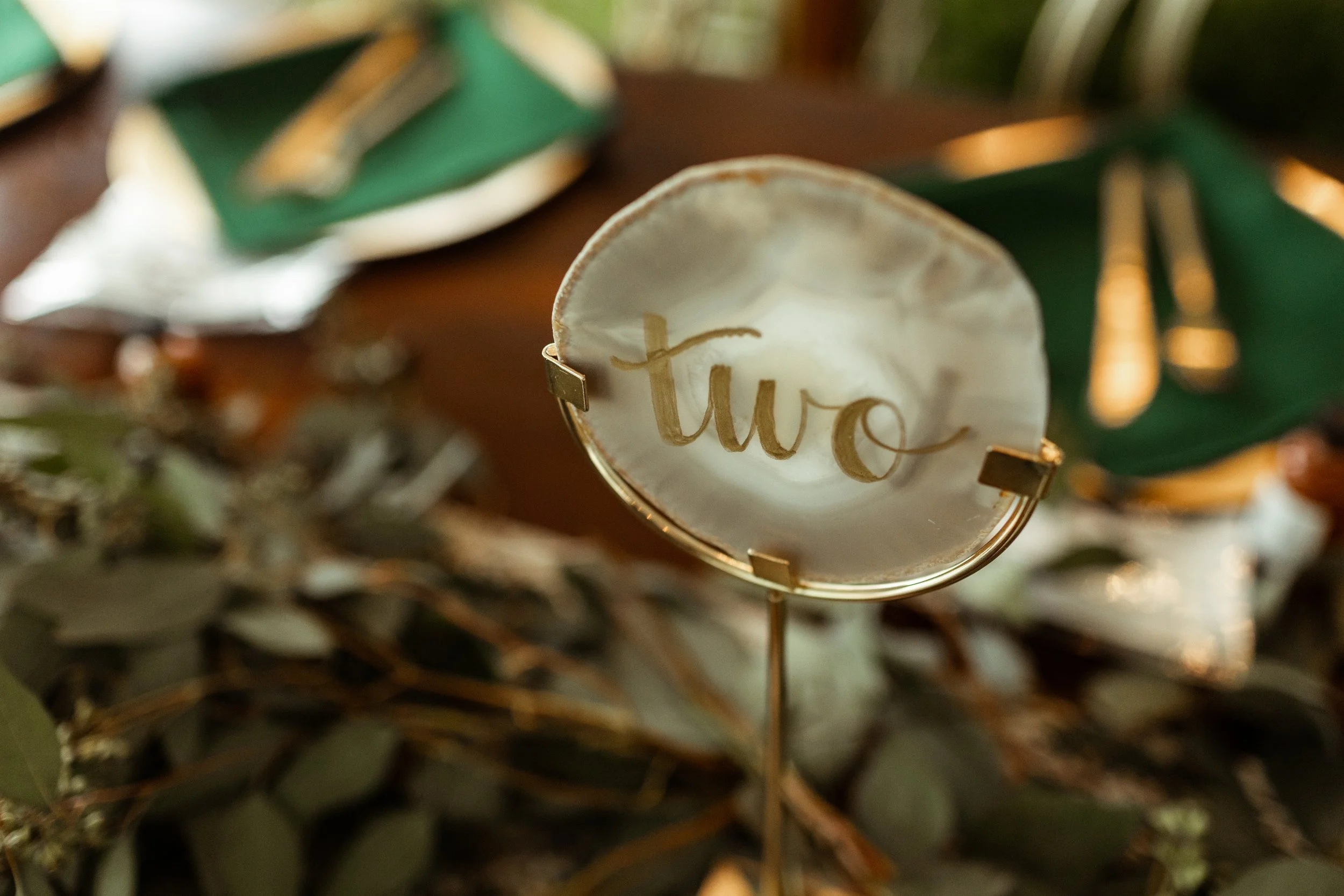
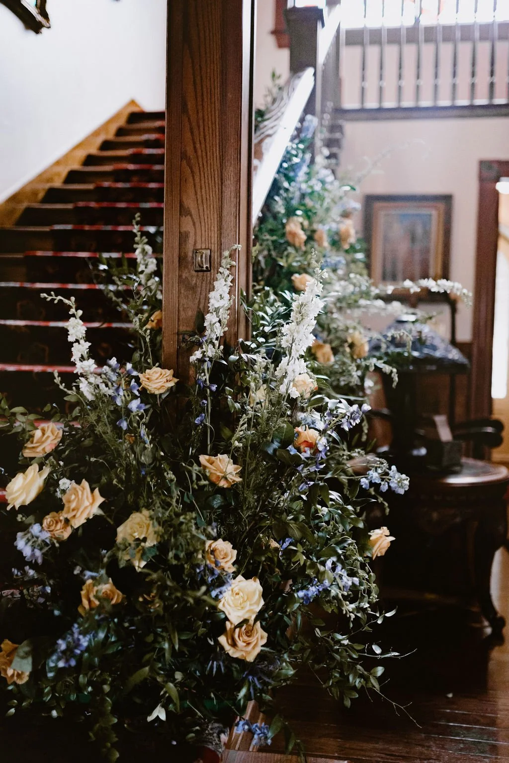
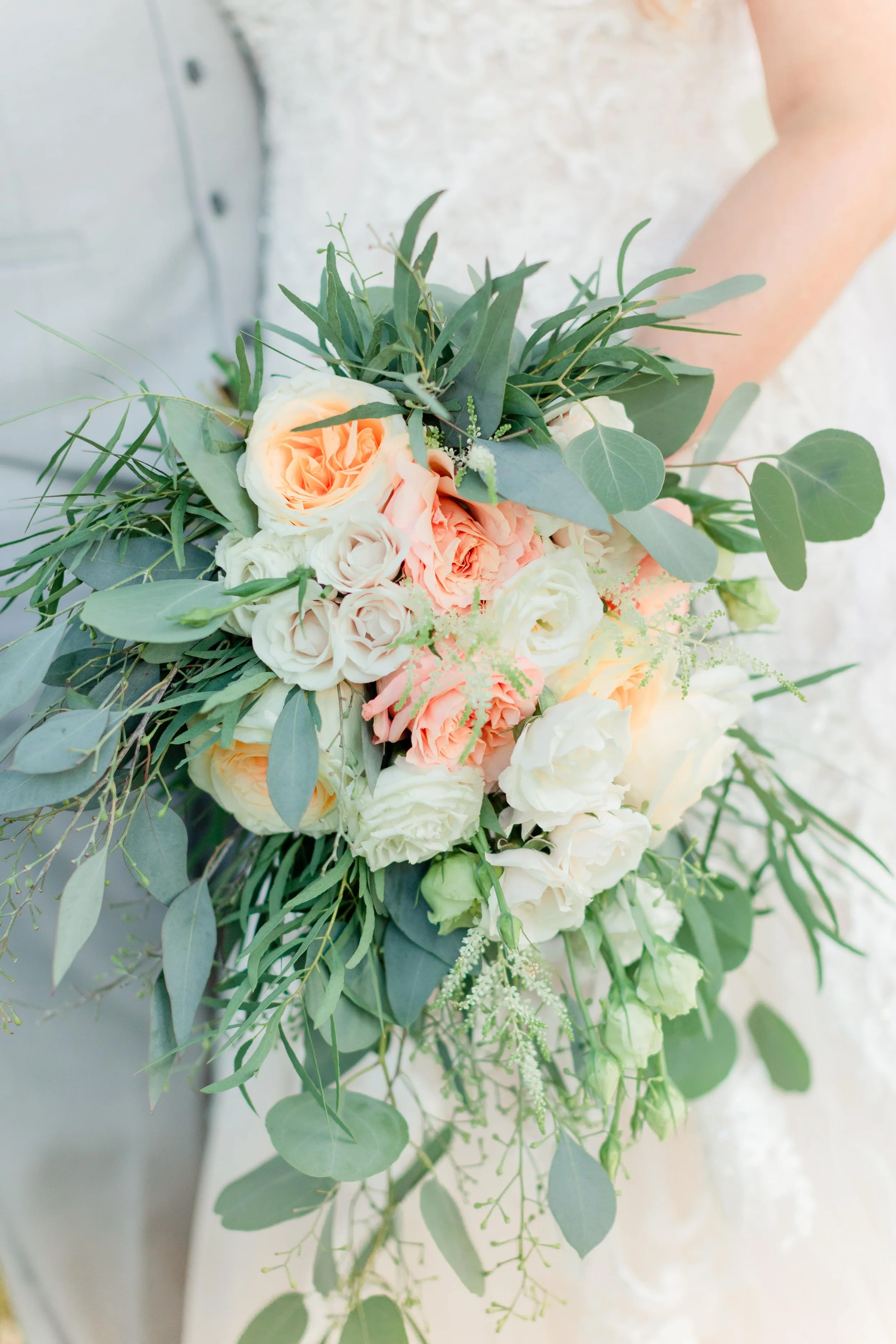
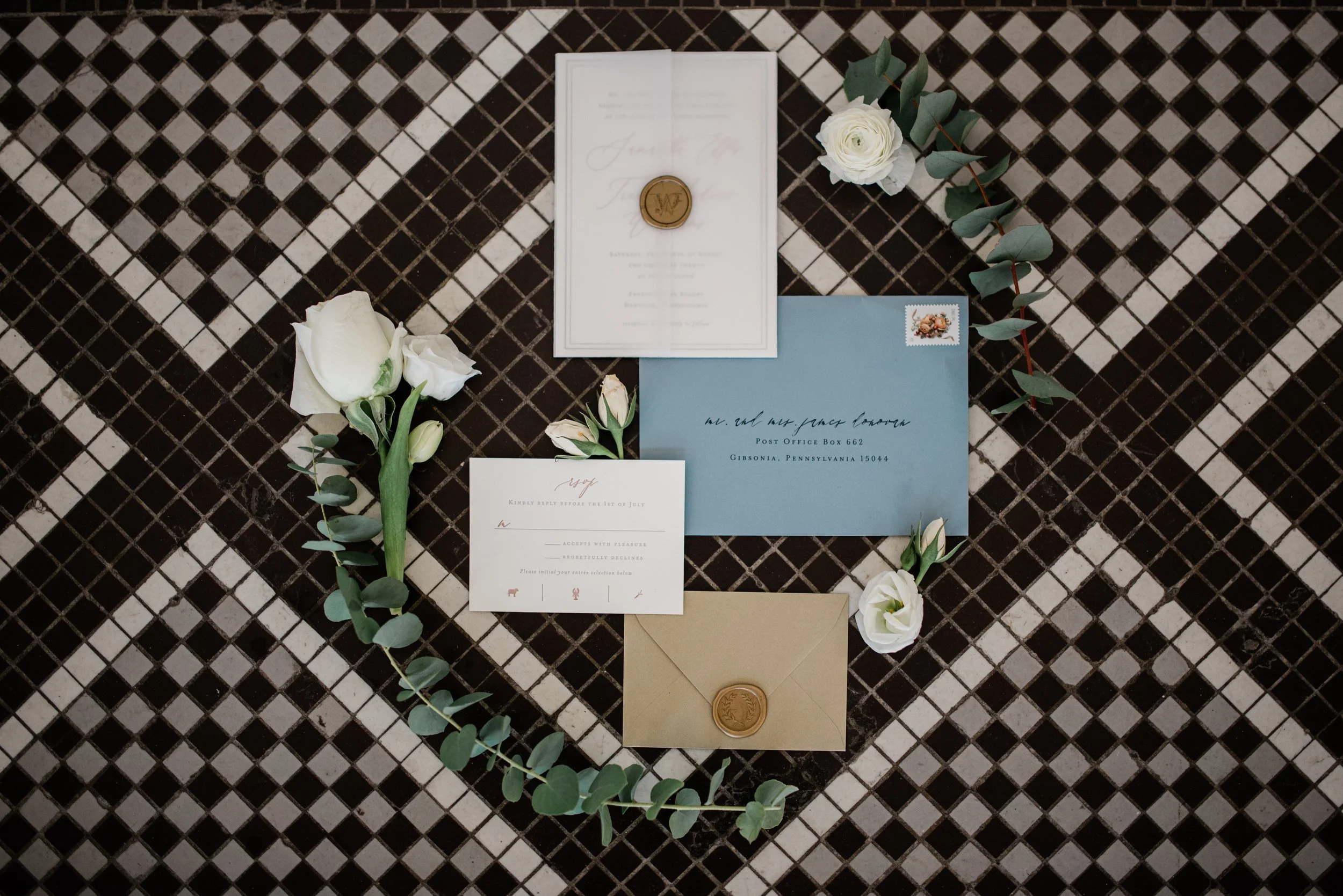
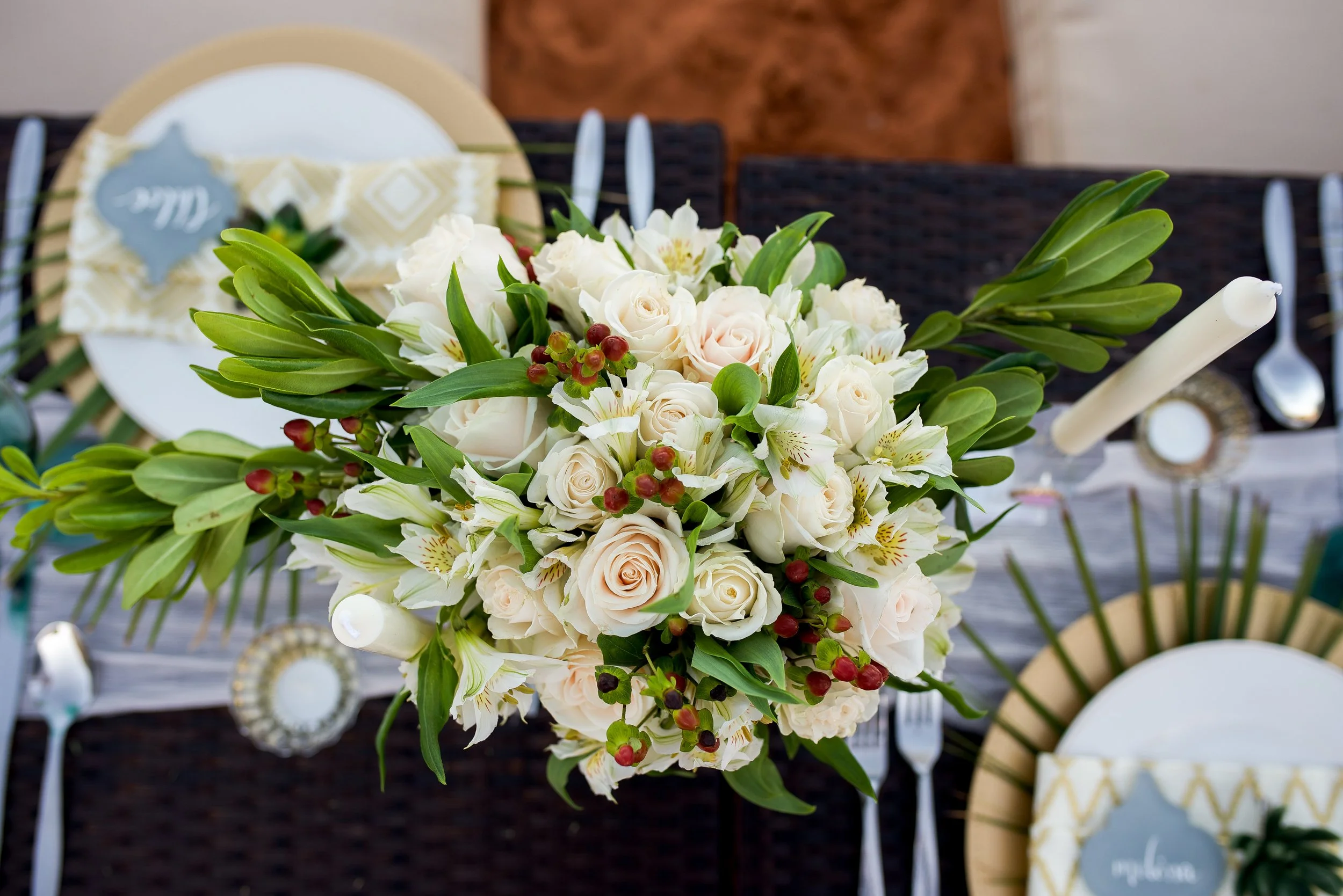
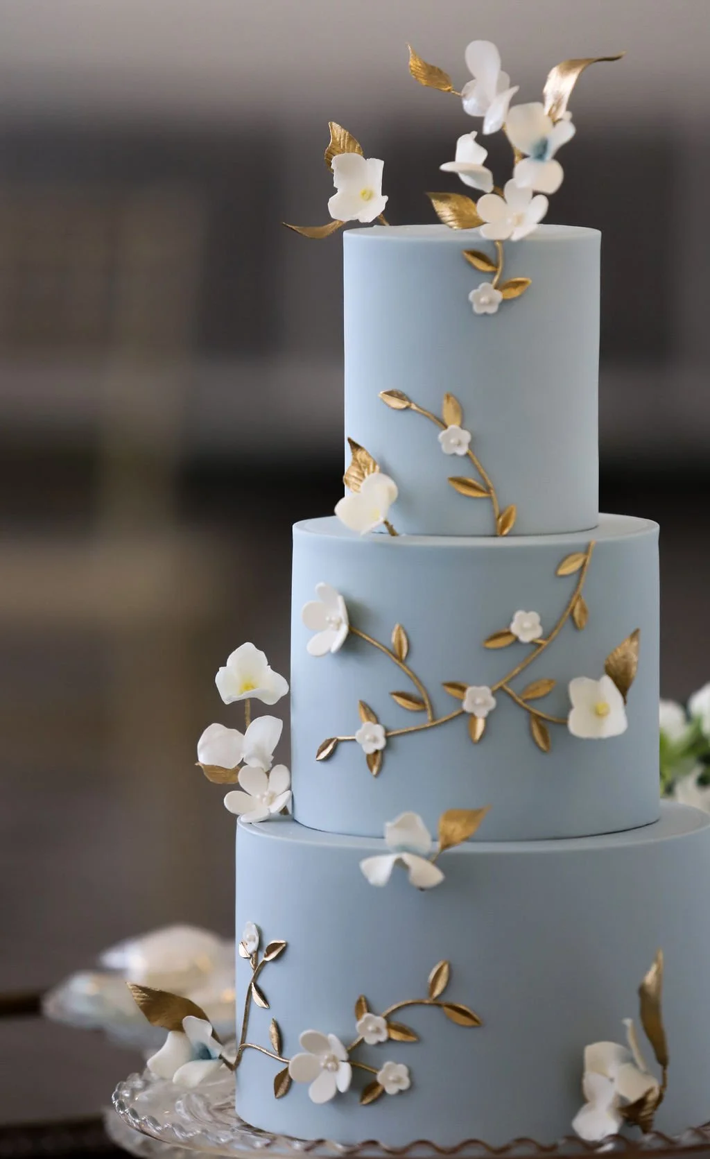
Jenn Marie Photography, Buhl Mansion, Priory Bakery

Do you like any of these better than Pantone’s Veri Peri? Which is your favorite? Have you seen any other colors of the year? If so, drop them in the comments; I’d love to see them. I love hearing from all of you, so chime in with a comment to keep the conversation going.
Thanks to Thursd, Better Homes & Gardens and Architectural Digest for the color lists.
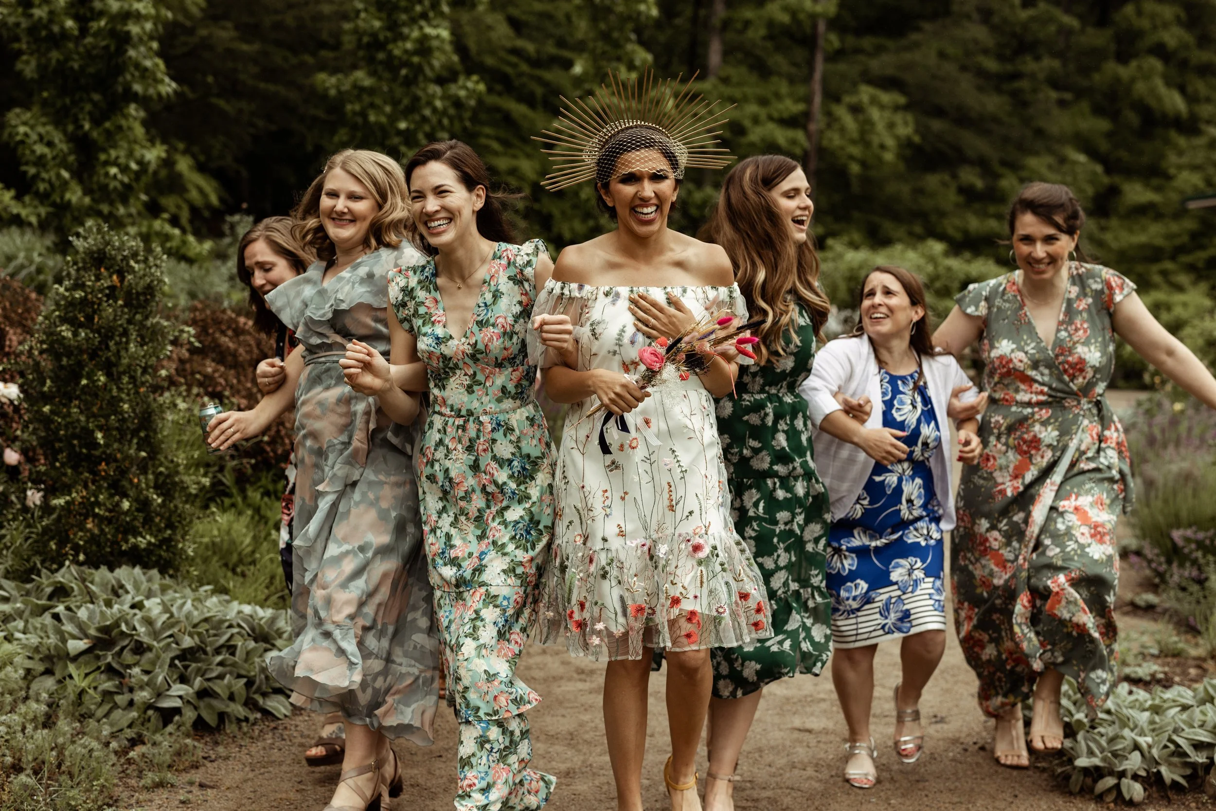
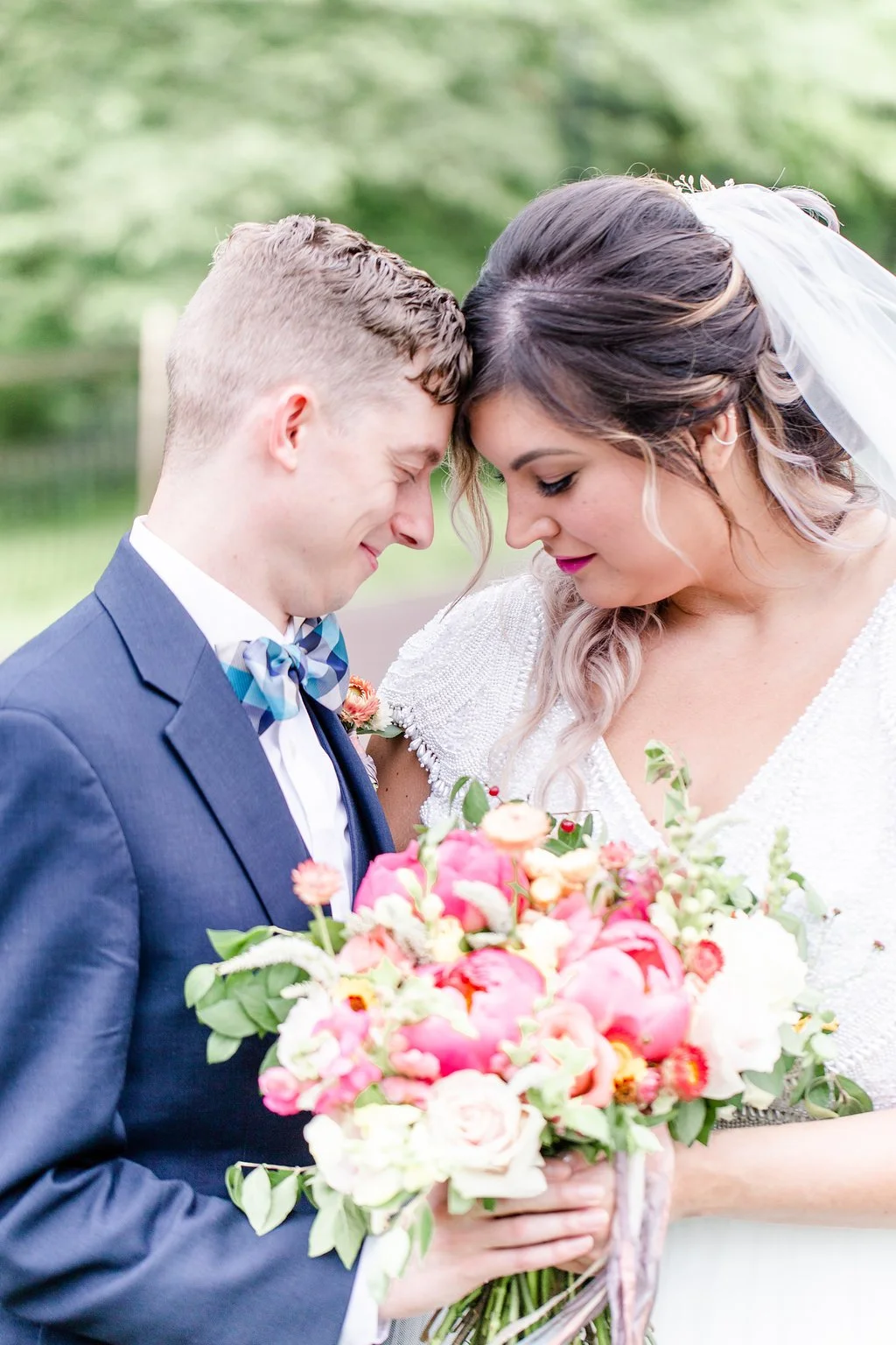
Header and title images by Jackson Signature Photography.