
Pantone announced its 2019 Color of the year this week, as it does every December, and the wedding industry is buzzing about the selection.

Pantone has many things to say to describe their color selection, including that it:
welcomes and encourages lighthearted activity
represents the fusion of modern life
is a nurturing color that appears in our natural surroundings and at the same time, displays a lively presence within social media
embraces us with warmth and nourishment to provide comfort and buoyancy in our continuallyshifting environment
Calling it vibrant, yet mellow, the Pantone website says that the color choice is a response to the prominence of digital and social media being embedded in our lives as we seek “authentic and immersive experiences that enable connection and intimacy. Sociable and spirited, the engaging nature of PANTONE 16-1546 Living Coral welcomes and encourages lighthearted activity. Symbolizing our innate need for optimism and joyful pursuits… [and] embodies our desire for playful expression.”
“Living Coral: An animating and life-affirming coral hue with a golden undertone that energizes and enlivens with a softer edge...vivifying and effervescent, mesmerizing to the eye and mind.”
I don’t know about you, but I think that sounds like a whole lot of big stuff to saddle a color with]. And while I don’t disagree with their overall commentary on the fusion of technology and social media with nature in our current landscape, I’m really, really not excited about this color.
Personally, I think coral had its day, especially in weddings — please see all Hallmark wedding movies from 2010-2015. The Pittsburgh wedding trends tend shift less quickly than in other markets, so I imagine we’ll have a little while before we starting seeing this saturate our market. I hope the extra time will help temper the influx of this color in favor of darker jewel tones and other hues that feel a little less like they walked straight out of My Little Pony.
I think there will be three key things to avoided when choosing living coral.
For the love of all that is holy, avoid anything beachey. This will most definitely come off looking cliched and over used, and potentially like one of those rental beach house that threw up nautical and beach decor.
Avoid pastels. Pairing this color with too many other light toned colors will make it looked like you picked your colors out of an Easter basket. It also runs the risk of looking extremely juvenile.
Avoid navy blue, teals, and minty greens. Also, chevron patterns. These color palettes and patterns were hugely popular a few years ago and your wedding will look like every third Pinterest wedding board.
I think the most striking use of the color will be to use it strategically as an accent color with other statement colors, particularly brights and warm tones, that keep it from falling too far into the overdone and cliched realm. Here is some inspiration if you want to incorporate the color into your wedding.
The living coral tinted roses are a perfect floral in this statement arrangement from a Pittsburgh vintage heirloom styled wedding at Mansions on Fifth.

Photo by Jenn Marie Wedding Photography.
This floral headpiece, created by Posy, is another use of coral as an accent color.
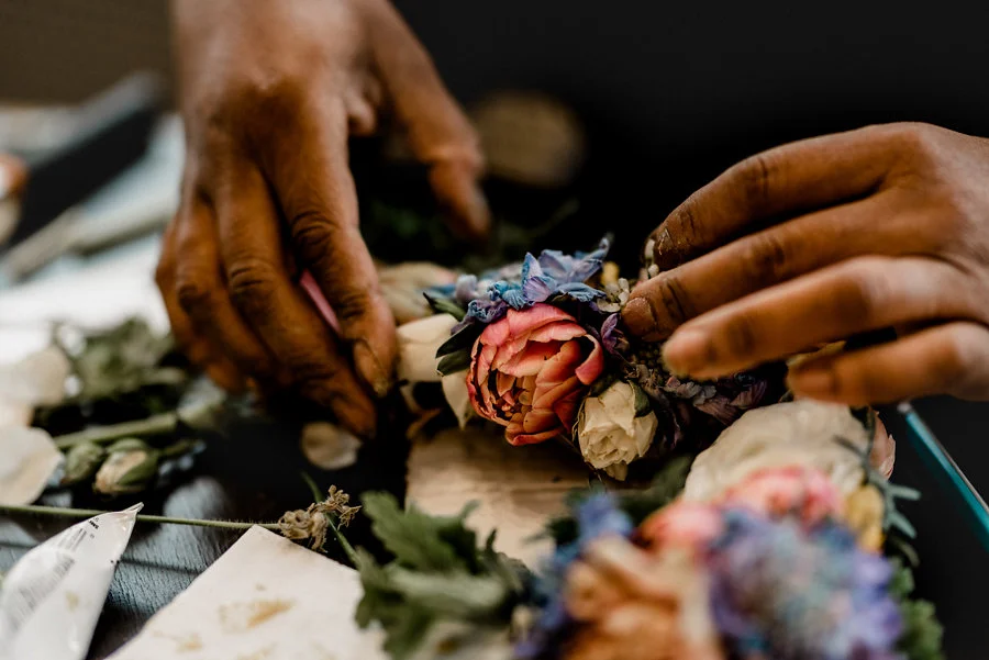
Photo by Jenn Marie Wedding Photography.
This summer styled wedding featured coral in the linens and the flower garlands for the guest tables. The mix of colors kept it from feeling to dated or overwhelming.

Photo by Samantha Zenewicz Photography.
This amazing wedding cake created by Four Oaks Bakery also pairs living coral’s vibrancy with other colors to create a full color palette.

Photo by Samantha Zenewicz Photography.
For a more understated look, a few colored blooms mixed with white create a beautiful bouquet, like this one created by Brides and Butterflies.

Photo by Lyn Michael Photography.
While I’m not feeling this color at all, I do enjoy a challenge. I’m excited find creative ways to use Living Coral in the coming year in fresh, different ways to create weddings that will look timeless and personalized, and not like every other wedding that uses this color. You can see my ideas on my Pantone Color of the Year Pinterest board.
What do you think — Love the color? Hate it? Apathetic about it? Don’t know why anyone cares what Pantone thinks anyway? Hit the comment button and let me know. If you are interested in reading some more social commentary on the selection, check out these two articles from The New York Times and Slate. (Yes. I know, I’m a huge dork. It’s ok.)