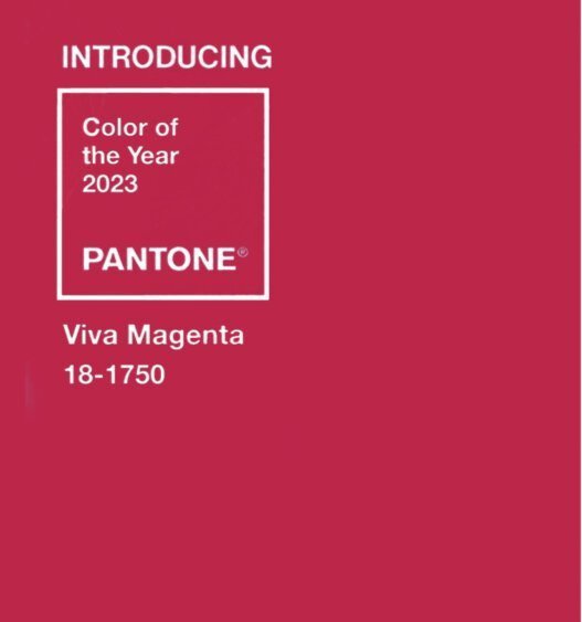
Finally, a truly inspiring Color of the Year
If you’ve been around for any amount or time, or even just read a past color of the year post, you know that I love a truly saturated jewel tone. And finally - Finally!- Pantone has delivered one for its famous (or infamous) Color of the Year selection.
This shade of magenta is rooted in the reds of nature; according to color psychology, reds are power colors that celebrate life. Pantone says this bold pinky shade represents “reveling in pure joy,” “encourages experimentation and self expression without restraint,” “welcomes anyone and everyone with the same verve for life and rebellious spirit. It is a color that is audacious, full of wit and inclusive of all,” and finally, “whose exuberance promotes a joyous and optimistic celebration.”
All of these are qualities that I try to bring out in Bespoke & Beloved couples’ weddings.
“Viva Magenta ... balances boldness with a feeling of fun, ... exudes rebellion, but not at the expense of softness. It embodies an expression of fierce grace, inspiring us to show up with confidence and humanity.”
Using Viva Magenta in Your Wedding
There are basically 4 ways to pair magenta with other colors in your wedding:
with neutrals so that it is the clear focus — and don’[t forget metallics count as neutrals
with complimentary, but more muted, colors so that it is the main focus
with complimentary bright or jewel-tone colors for a bold and colorful look
with other hues of magenta for a monochromatic statement. (This is a huge upcoming trend in fashion, so expect to see it translating to weddings as well.)
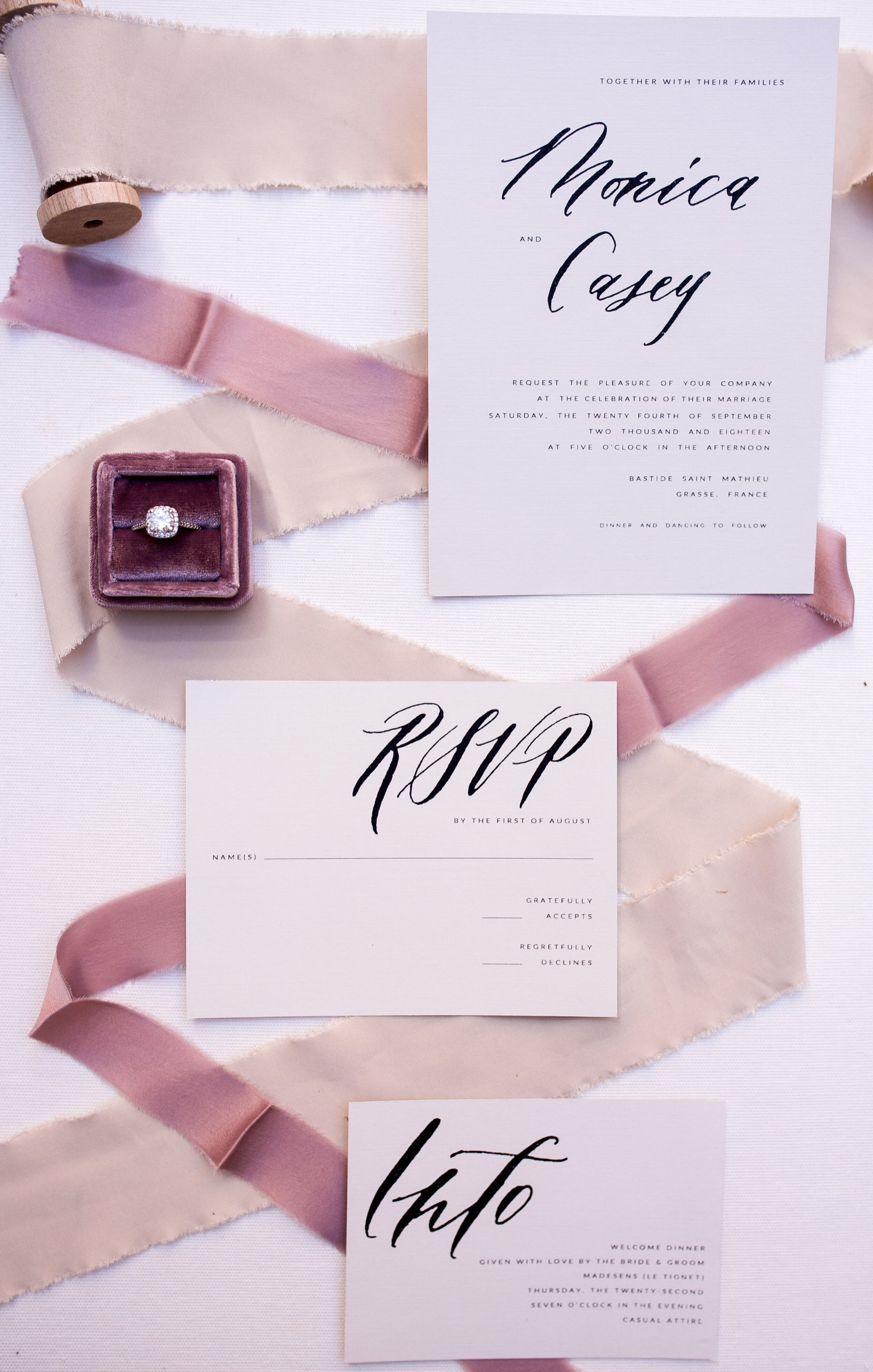
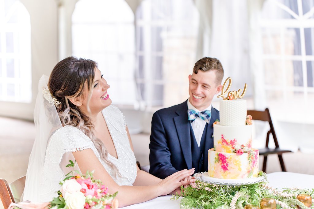
*The photos in this post aren’t exactly Viva Magenta, but they’re close enough to give you an idea how you could use a magenta shade in your wedding design.
Places to Showcase Vivid Magenta
Your Outfits
Your clothes; your wedding parties’; heck tell all your guests to wear it - whoever is wearing it, clothes are a great place to showcase color as a main focus or as an accent.
Florals
It seems obvious, but your wedding flowers are a great place to incorporate pinks of all shades.
Cake
I love a colorful wedding cake.
Stationery
Your stationery sets the tone of your wedding for your guests, so if you plan to use Vivid Magenta in other aspects of your wedding, you stationery is a great place to feature it.
Other Colors of the Year
Plenty of companies in interior, home, and fashion designs choose colors of the year, and many of them chose hues in the red and pink family.
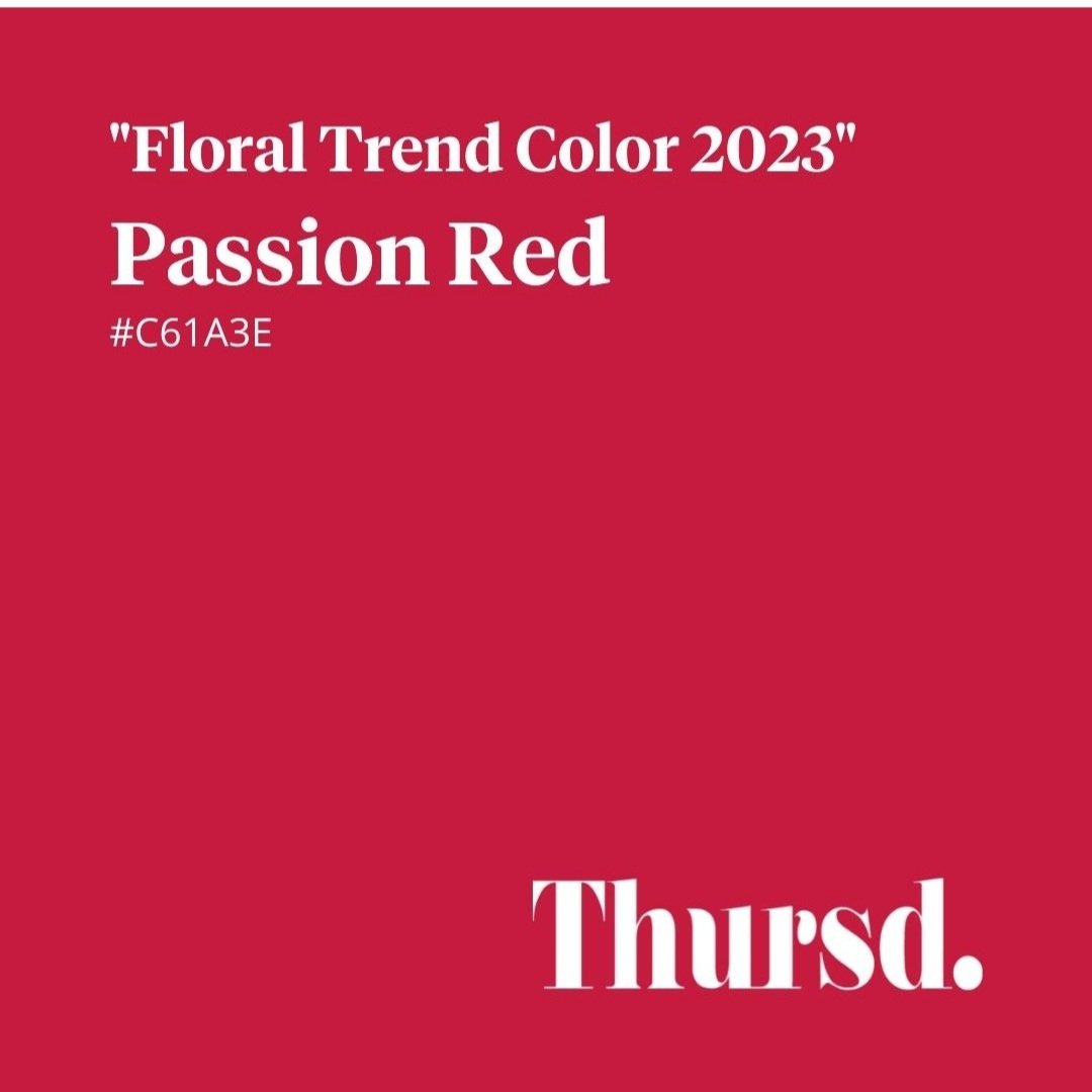
Thursd, a floral trends magazine, selected Passion Red, which is nearly identical to Vivid Magenta. (And it should be noted that Thrusd selects their color of the year months before Pantone releases theirs.)
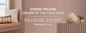
Benjamin Moore selected Raspberry Blush, which is also very similar to Pantone’s magenta; and Sherwin Williams’ pick, Redend Point, is a pastel tint of this color family.
Better Homes & Gardens’ pick of Canyon Ridge is more peachy toned than the others, but is still in this color family.
The only company to depart from the reds and pinks that I found was Gliden and PPG, who chose a glorious dark green blue - Vining Ivy. But even this is still a lovely saturated jewel tone. (Cue Dara’s happy dance music!)
So, what do you think — Love the color? Hate it? Apathetic about it? Don’t know why anyone cares what Pantone thinks anyway? Hit the comment button and let me know.
Title image photo by Jenn Marie Creative Co. Cake by Four Oaks Bakery.


